
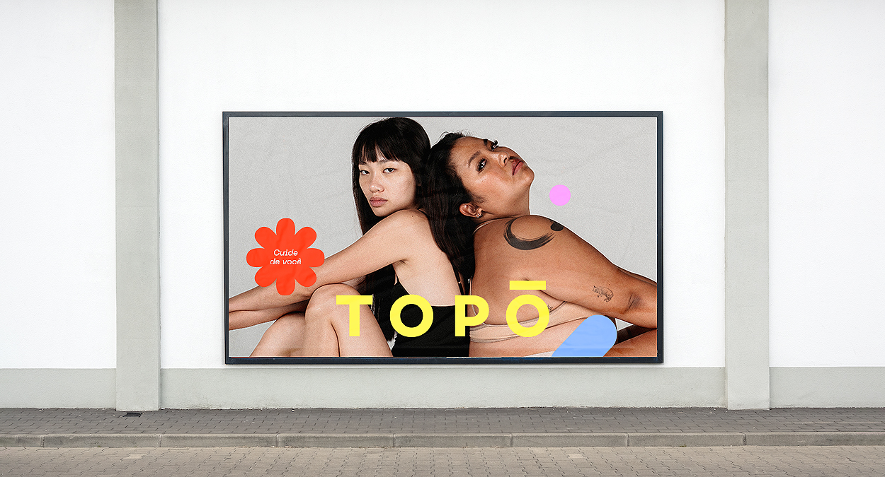
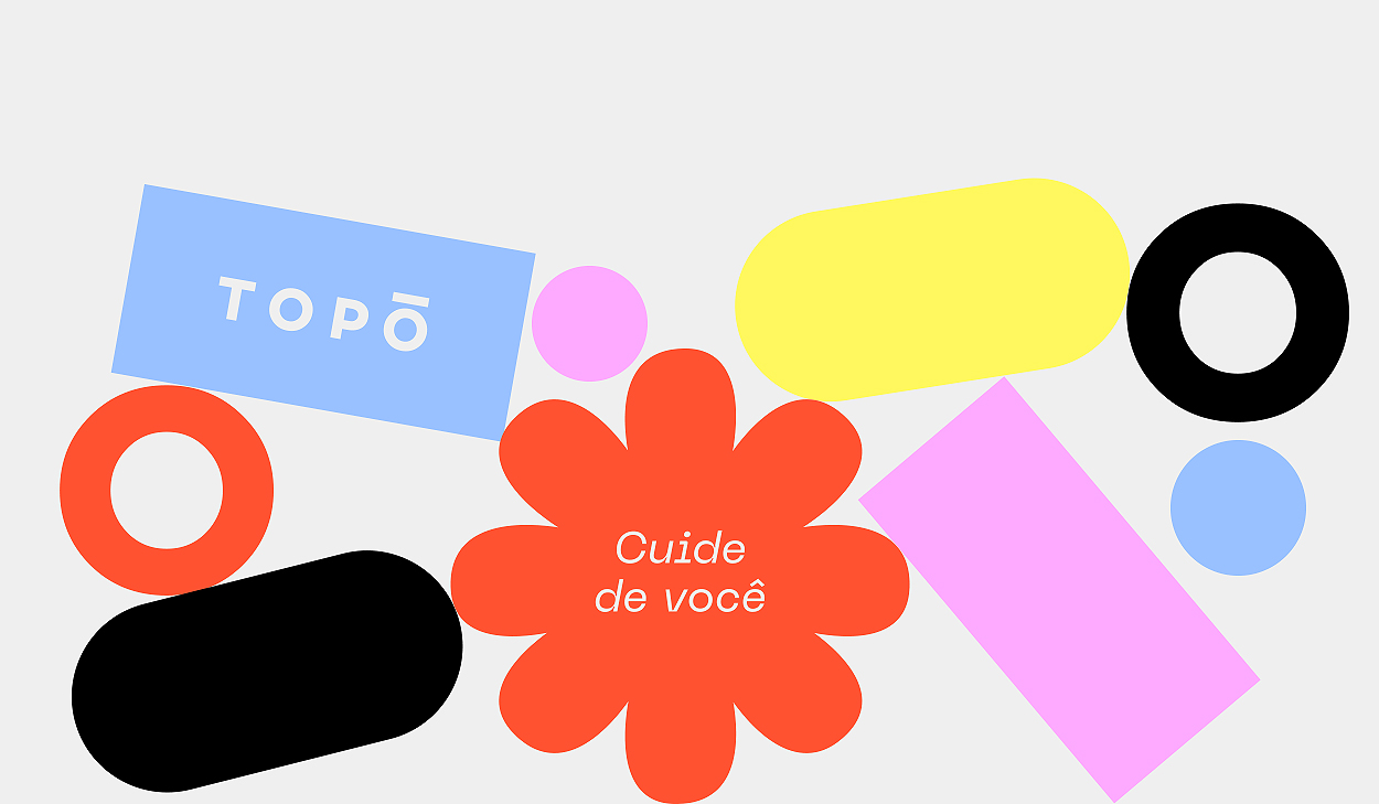
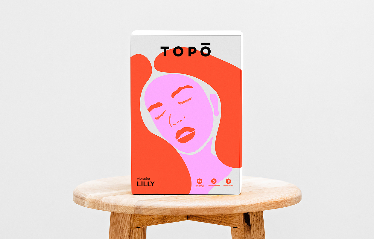

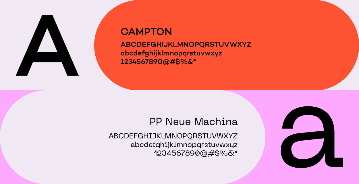
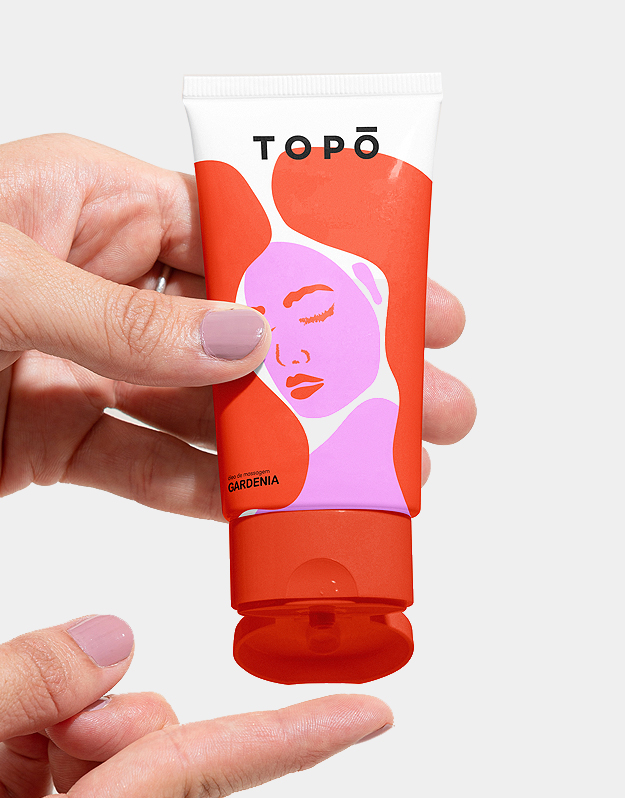
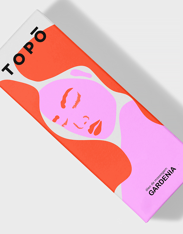
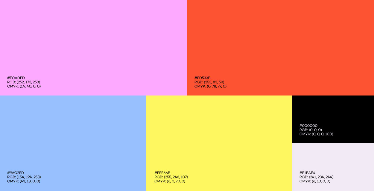
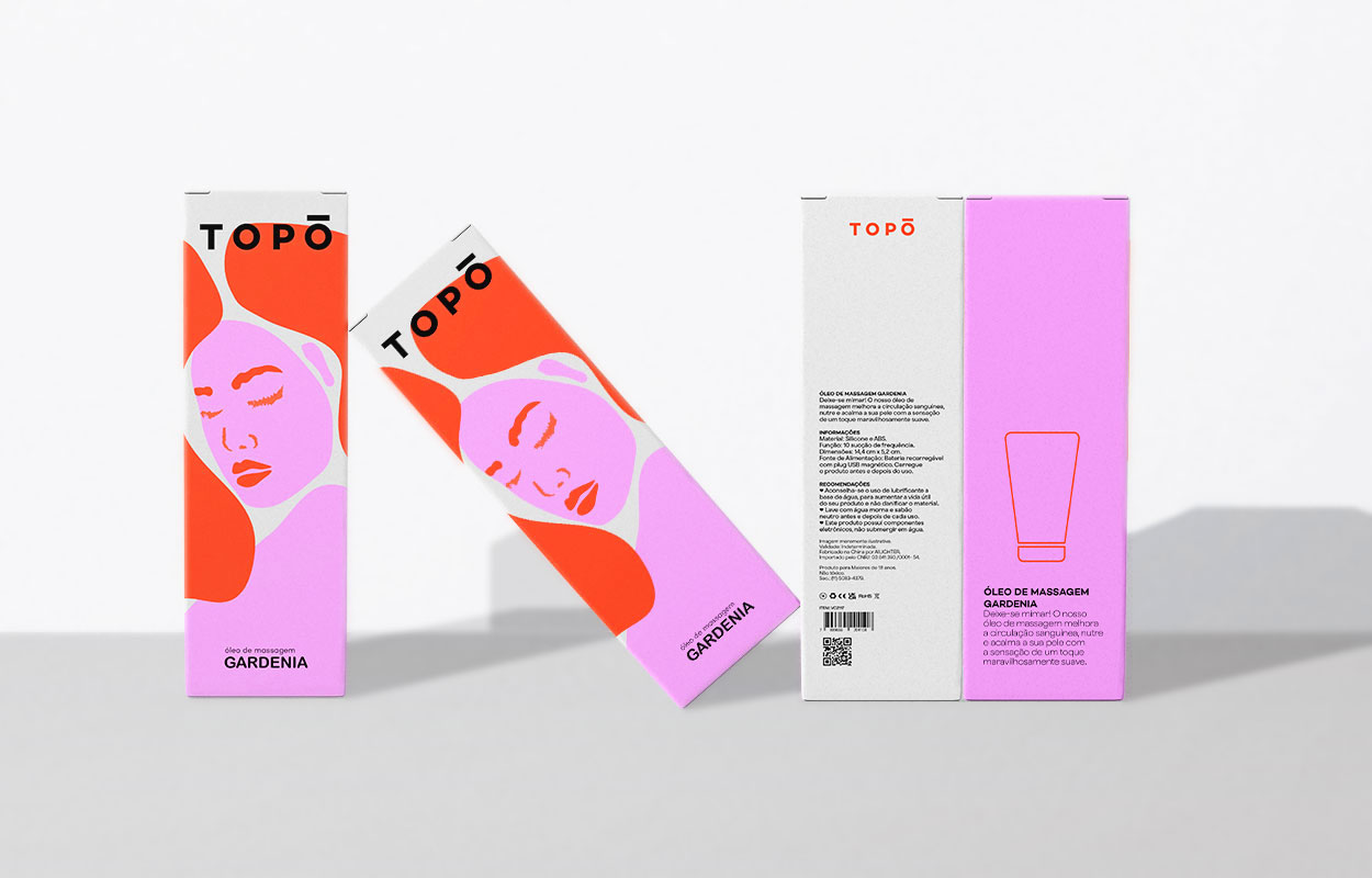

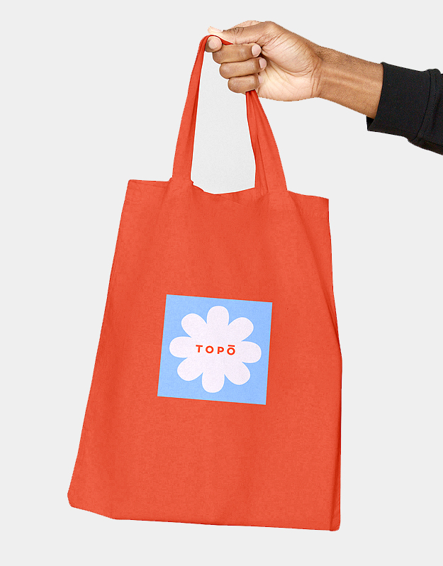

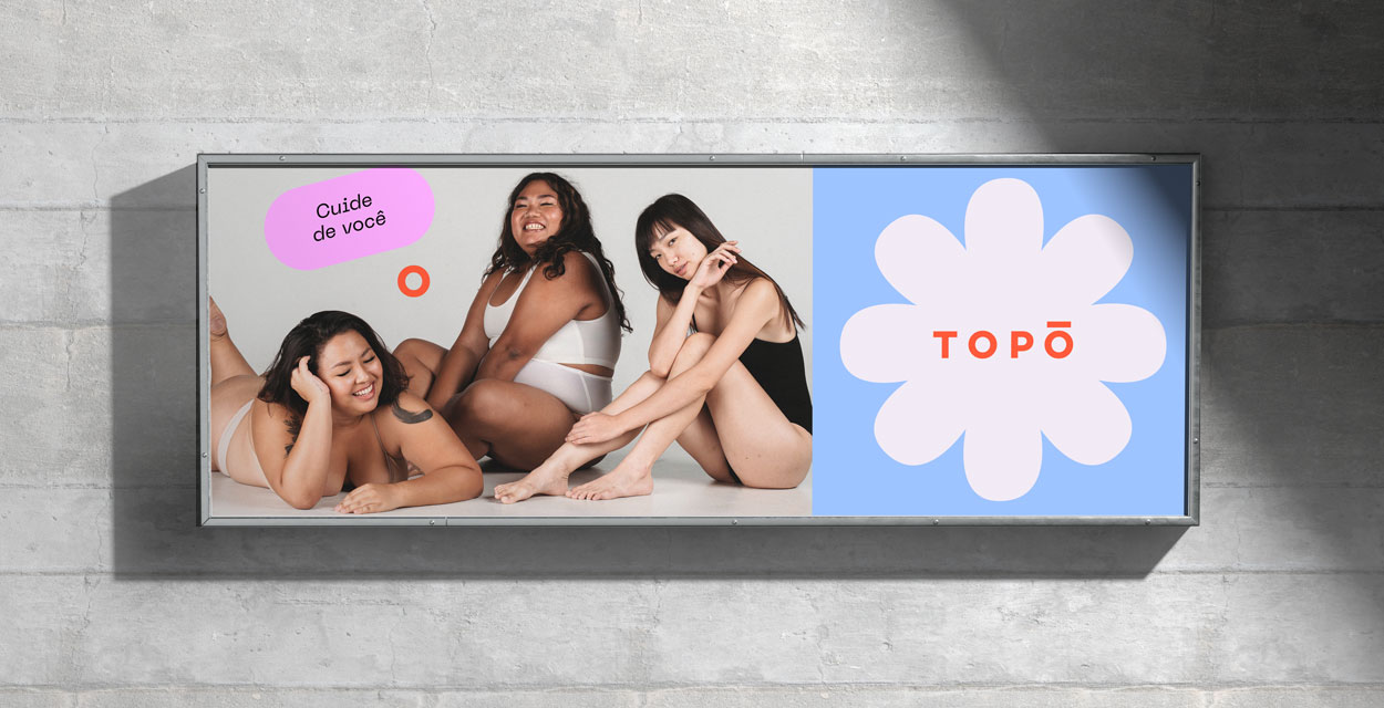
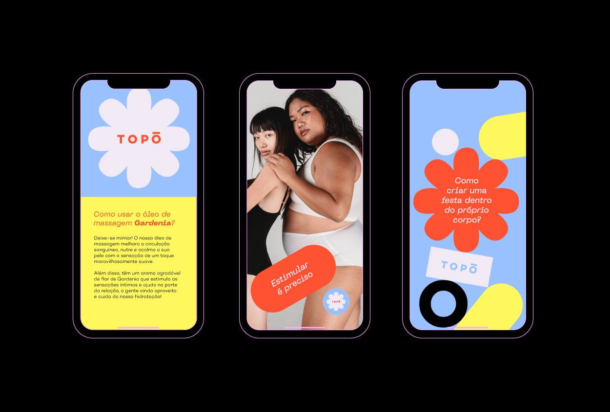
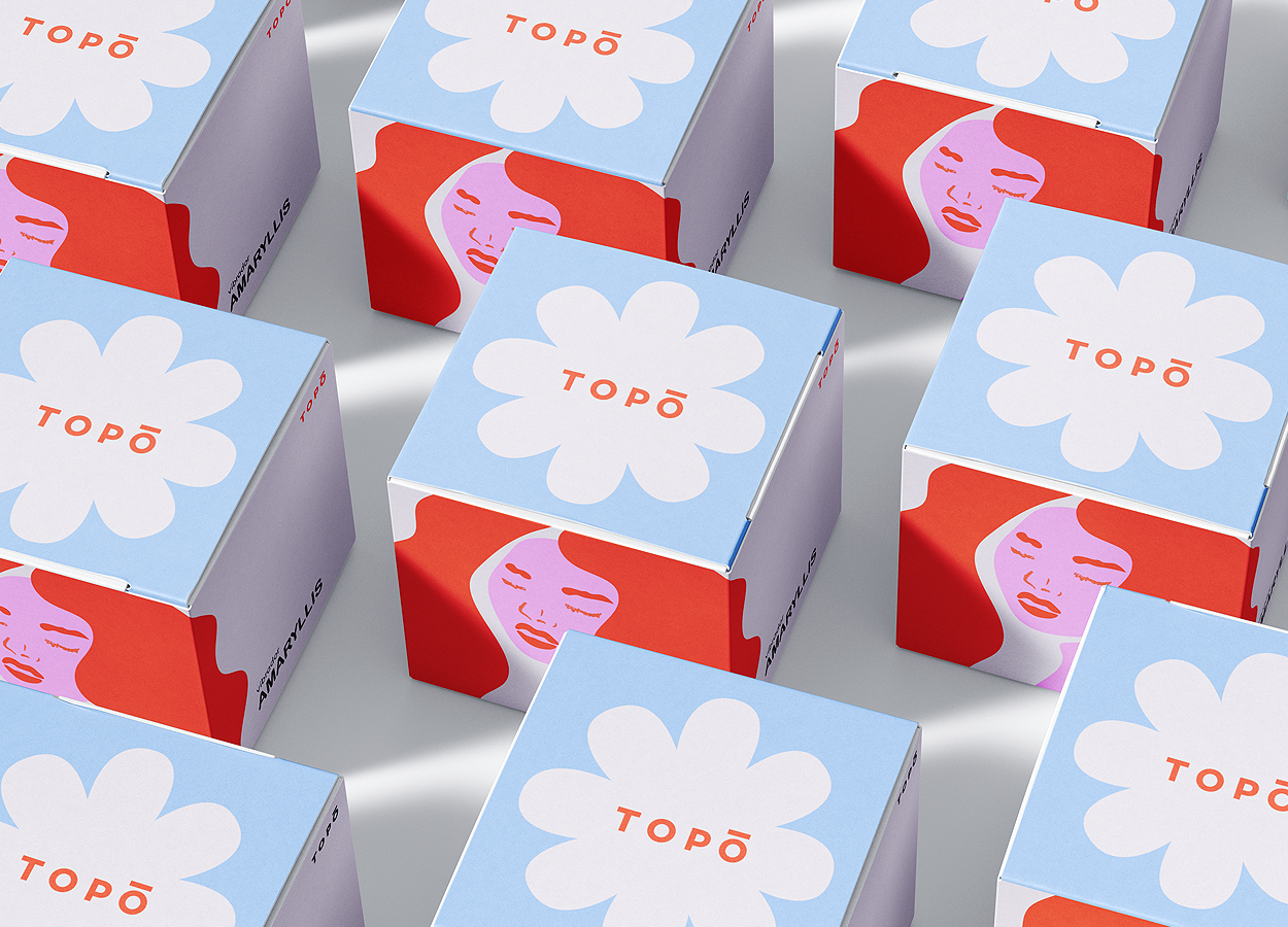
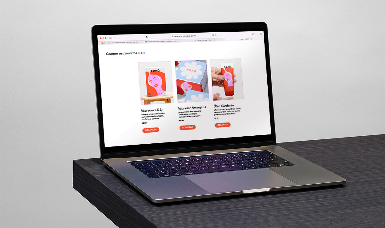
︎︎︎ The new TOPO visual identity reimagined a Brazilian sexual wellness brand with a modern and empowering design. It combined handcrafted illustrations of women with bold geometric shapes to balance intimacy and strength. A vibrant color palette — pink, red, light blue, and neon yellow — gave the brand a fresh, standout look. Minimalist packaging designs emphasized these colors with clean layouts, creating a sense of clarity and sophistication. Typography played a key role, with the bold Campton font and the sleek PP Neue Machina adding a contemporary edge. The result is a cohesive identity that reflects TOPO’s mission to redefine self-pleasure with confidence and style.
 © 2025